
When I started on my bullet journal journey, I looked to Instagram and Pinterest to gain inspiration for my layouts.
Having come from using a standard week-to-view academic diary for years and then designing my own planners, I was pretty sure I needed a weekly overview of what was going on. I knew I wanted to record meetings and tasks for each day, but I also needed to note down childcare arrangements and menu planning. I decided to trial some layouts in my pink, lined A5 Daycraft bullet journal (US, UK) to see which I liked best.
In the interests of fair testing (that’s the scientist in me talking) I decided that it was necessary to try out each layout for a couple of weeks – what might have been considered a bad week for organisation and blamed on the weekly planning layout might just have been a hideous week for other reasons and not the bullet journal’s fault!
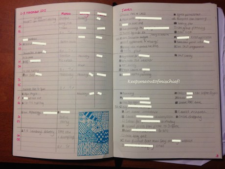
The first layout I went with was this horizontal version. This worked well, I could see the overview of the week on the left and my tasks were listed on the right. As it was a weekly layout, I didn’t need to migrate tasks each day because I could still see them on the page. This worked really well for me. Due to the nature of my dual role at work, I have to be mega-flexible and adapt to changes as the day progresses which often means that tasks don’t get done until Friday morning when I hide in an office and blitz the task list. I left the space for tasks beside Saturday and Sunday combined and used it for home tasks and confined work tasks to the weekday boxes in the hope that I’d complete everything and not need to take work home. This is wishful thinking – I never get everything done at school, needy children always take priority. I ended up with a blank space on the left under the childcare arrangements (they’re still both a bit too little to have separate plans at the weekend- I know the time will come when they have a better social life than me, I’ll adapt my layout when that happens!) so I decided to spend a bit of creative time filling it with a Zentangle. I liked this layout but I found, over the weeks that I used it, that I didn’t really have space for all of my work tasks to be noted.

The second layout was a vertical version with all the same features as the previous horizontal spread. I found that this gave me a much better amount of space to record work tasks but the box at the top of each daily column where I recorded events and appointments was just too small.

The third layout that I drew out on my journal, inspired by some of the daily layouts I’d seen on the #planwithmechallenge on Instagram never got used. Having spent a month with the vertical and horizontal layouts, the lack of boxes on this layout threw me! I couldn’t work out how to manage each day and didn’t think I’d have enough space for tasks – this was especially important as these spreads were drawn in for the final weeks of the Autumn term when we’re fast approaching Christmas and we descend into disorganised chaos!I decided to use my experience (and some more social media inspiration) to create another layout.
I made a list of what I had on the page sorted into three categories:
To keep:
- Weekly overview.
- Space for events and appointments.
- Menu plan.
- Task list – split into home and work.
To get rid:
- Childcare plans – this is recorded on my monthly overviews and I only refer to it at the beginning of the week.
To try:
- Space for a shopping list.
- Best things each day.
This was the layout I created.

It worked fairly well for me, but I don’t like the lack of structure to my work tasks. I can’t prioritise from it and it slows me down as every time I sat down to attack the list of tasks I had to read everything. I tend to keep my journal open on my desk at work and I don’t really want my colleagues or class members to be reading my list of ‘best things’. I’d added a shopping list area but I found I was doing my menu plan, writing my shopping list and then immediately transferring it onto the online shopping app that I use. I seemed to be writing a list unnecessarily.
These three issues mean that I’m going to have a rethink about how I structure my weekly layout. I’ve learned so much from trying out different ideas and gaining inspiration from social media in the past 2 months and I love the way the bullet journal is so adaptable so that I can change it when it’s not working for me.

Thanks for sharing your layout tests! I’m new to bullet journaling myself, and I’m still getting my bearings. This is a good post for reevaluating what’s working for you and what isn’t. It’s cool of you to lay it out like that. I’m shy about my own. :S I should take a closer look it, and maybe share it with the community.
LikeLike
Do you use Instagram? There’s loads of inspiration in a group called #planwithmechallenge.
LikeLike
Pingback: My Bullet Journal Journey: The First Three Months | Keeps Me Out Of Mischief!
Pingback: Bullet Journal Daily Layouts | Keeps Me Out Of Mischief!
Pingback: The Best Thing Today | Keeps Me Out Of Mischief!