This post contains affiliate links which help to maintain this blog.

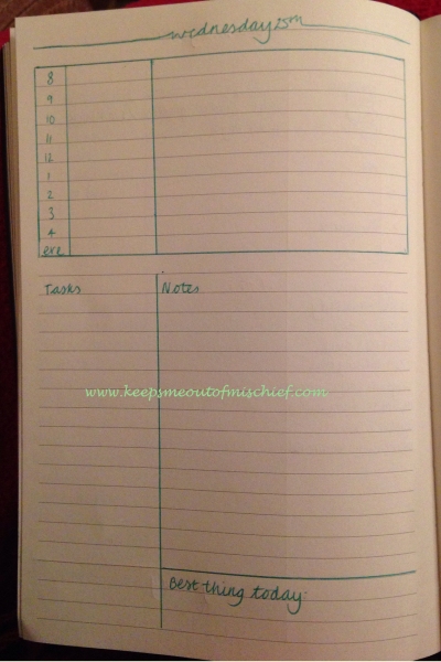
When I first started my bullet journal adventure, I was quite set on the weekly layout. I’d transferred from a week-to-view academic year diary so I was quite set in my ways of having a weekly spread where I could plan events and tasks. My journey through different versions of a weekly spread in my pink lined Daycraft bullet journal (US, UK) can be found here. After I’d been using the journal for a month I decided to have a go at a daily spread, with a weekly overview as back up. This was the design I used after gaining lots of inspiration from Instagram.

The week was an utter disaster. I liked different parts of this layout so decided to go back to a weekly layout using the elements that I’d found useful, such as the timeline and the Best Thing Today. As I keep my planner open on my desk in the classroom, I didn’t really want the record of the Best Thing Today to be on display all the time so I created a separate layout which I’ll share next week. The notes section on this layout was redundant for me because I keep a separate work notebook which I keep at school because it contains so much confidential information. The tasks section wasn’t wide enough and I ended up writing most tasks across two lines. Not great and it scared me away from using a daily layout for the whole of December.
It wasn’t until I did a termly review of working practices with my job share toward the end of December that I realised that I hadn’t really given the daily layout a fair trial – my job-share had been off that week with Shingles; my eldest had been ill at the beginning of the week and my youngest came down with chicken pox towards the end of it. As my job share was off I’d been trying to do both of our jobs. It was a horrendous week and because of that, the layout hadn’t really had a fair trial.
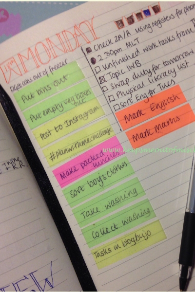
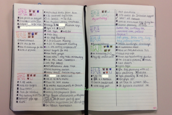
I decided when I went back in the New Year that I would have another go with the daily layout with a weekly view as a back up and a place to record tasks for later in the week. This was my first layout. I drew a section on the left for personal tasks and the wider section on the right was for work related tasks. I introduced the post-it flags for recurring tasks after about a week as I got fed up of writing out the same tasks again and again! You can read how I chose which tasks I assigned a flag to here.

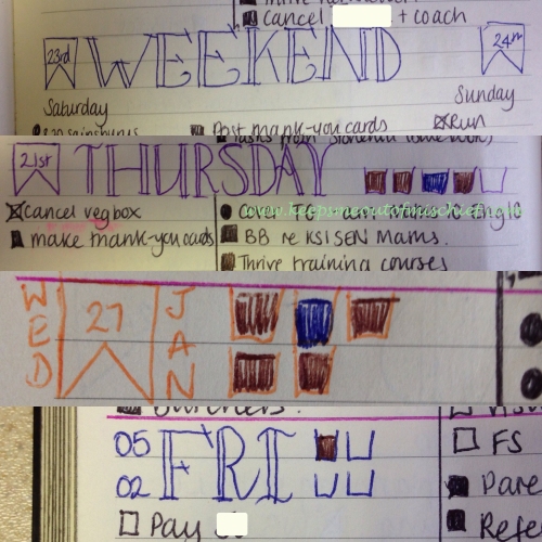
This new layout was really working for me so I started to play around with the header design. I reduced the size so that it only filled the column on the left, this had the effect of making the work tasks look like one massive list which was overwhelming. Luckily, I asked for help on the #planwithmechallenge on Instagram and @em_plans had the bright idea of separating each day with a line. This I did in the same colour as the header and immediately I was calmer.

I’ve found that I’m no longer relying on the weekly layout at all, so I’ve stopped using them although I’ve stuck to the same daily layout as we’ve moved into February, now I’m just playing with the headers!

Do you bullet journal? Which do you prefer – dailies or weeklies?
I like the idea with the post-its for reoccuring tasks. I imagine they are especially helpful since you can just move them to the next day/week/month when done and then not think about them any more.
LikeLike
That’s exactly what I’ve found. They save paper and make my day look less manic because there’s no record of them at the end of the day apart from the fact they’re no longer there so I know they’re completed. Thanks for visiting!
LikeLike
This has given me such a good idea. Not the same as yours, but I was inspired. Thanks for sharing!
LikeLike
I’m glad you got some inspiration, thanks for visiting!
LikeLike
Pingback: My Bullet Journal Journey: The First 6 Months | Keeps Me Out Of Mischief!
Pingback: Happy Birthday Keeps Me Out Of Mischief! | Keeps Me Out Of Mischief!